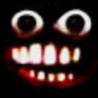
rapperdan 2,323 / 0 Report Post Posted July 23, 2017 Edited July 23, 2017 by rapperdan Well since it seems I can't pm some of you I would like to show you guys the improvements I had someone make on your logo. feel free to say what you think. Improvements on this concept Edited July 23, 2017 by rapperdan The best server in GFL better then MilkMans TTT server will ever be Share this post Link to post Share on other sites More sharing options... Achievements 3
Joshy 4,382 / 45,371 Report Post Posted July 23, 2017 What's the middle red dash for? Share this post Link to post Share on other sites More sharing options...
rapperdan 2,323 / 0 Report Post Posted July 23, 2017 Edited July 23, 2017 by rapperdan 1 minute ago, Joshy said: What's the middle red dash for? Not sure I think it's just to keep the faze feel that it had. Again I did not make it. It's to make this readable Edited July 23, 2017 by rapperdan The best server in GFL better then MilkMans TTT server will ever be Share this post Link to post Share on other sites More sharing options... Achievements 3
Joshy 4,382 / 45,371 Report Post Posted July 23, 2017 4 minutes ago, rapperdan said: Not sure I think it's just to keep the faze feel that it had. Again I did not make it. It's to make this readable The dash in that image is clearly a part of the 'L', and so preserving the dash in your current image is... I think it's silly. Sorry. Share this post Link to post Share on other sites More sharing options...
rapperdan 2,323 / 0 Report Post Posted July 23, 2017 Edited July 23, 2017 by rapperdan 1 minute ago, Joshy said: The dash in that image is clearly a part of the 'L', and so preserving the dash in your current image is... I think it's silly. Sorry. Ty I will talk to the person who made it and request improvements. Edited July 23, 2017 by rapperdan The best server in GFL better then MilkMans TTT server will ever be Share this post Link to post Share on other sites More sharing options... Achievements 3
QiadoxSkel 86 / 3,049 Report Post Posted July 23, 2017 Edited July 23, 2017 by QiadoxSkel 13 minutes ago, Joshy said: The dash in that image is clearly a part of the 'L', and so preserving the dash in your current image is... I think it's silly. Sorry. This was just blind following of the style am already renderring a new version without it. I'll go ahead and edit it into this post when its done. http://imgur.com/a/Enln1 For reference these can be resized and recolored in a similar manner to traditional vectored images. It just requires more technical knowledge. Edited July 23, 2017 by QiadoxSkel Former CSGO Deathrun Admin Former CSGO TTT Manager Share this post Link to post Share on other sites More sharing options...
Joshy 4,382 / 45,371 Report Post Posted July 23, 2017 I'm not trying to hijack your thread, but if the only thing you're going to request change is the dash, then it's an easy fix: Share this post Link to post Share on other sites More sharing options...
rapperdan 2,323 / 0 Report Post Posted July 23, 2017 Just now, QiadoxSkel said: This was just blind following of the style am already renderring a new version without it. I'll go ahead and edit it into this post when its done. Ty I did not think you wanted to be known. The best server in GFL better then MilkMans TTT server will ever be Share this post Link to post Share on other sites More sharing options... Achievements 3
Leks 2,304 / 26,646 Report Post Posted July 23, 2017 Hey, that looks okay. Why don't we make a GFL Logo contest and see who makes the best one, for us to wear with pride as an avatar?! Share this post Link to post Share on other sites More sharing options...
QiadoxSkel 86 / 3,049 Report Post Posted July 23, 2017 Just now, rapperdan said: Ty I did not think you wanted to be known. I didn't want to be a part of your berating of the creative team. I'm fine with being known as the one who created it Former CSGO Deathrun Admin Former CSGO TTT Manager Share this post Link to post Share on other sites More sharing options...
rapperdan 2,323 / 0 Report Post Posted July 23, 2017 Just now, Joshy said: I'm not trying to hijack your thread, but if the only thing you're going to request change is the dash, then it's an easy fix: Hide contents Like I said it was only made to improve And keep the original concept they had. The best server in GFL better then MilkMans TTT server will ever be Share this post Link to post Share on other sites More sharing options... Achievements 3
Joshy 4,382 / 45,371 Report Post Posted July 23, 2017 Edited July 23, 2017 by Joshy - Edit Reason: response to leks; inserted "bad" into second sentence Another suggestion I'd like to make is incorporating something isotropic. Something GFL has compared to other communities is support for multiple games, and so I always really liked seeing things like circles or many sided polygons... I personally interpreted it as the many sides of GFL although I'm sure people don't look into meaning or analyze things as much as I like to do. edit: 10 minutes ago, Leks said: Hey, that looks okay. Why don't we make a GFL Logo contest and see who makes the best one, for us to wear with pride as an avatar?! I don't think that's a bad idea, but are there enough people interested to be contestants? A collaborative might not be a bad idea either. I'm not sure why Dan had to repeat himself. I didn't say anything that indicated a misunderstanding. Edited July 23, 2017 by Joshy response to leks; inserted "bad" into second sentence Share this post Link to post Share on other sites More sharing options...
rapperdan 2,323 / 0 Report Post Posted July 23, 2017 Edited July 23, 2017 by rapperdan 3 minutes ago, Leks said: Hey, that looks okay. Why don't we make a GFL Logo contest and see who makes the best one, for us to wear with pride as an avatar?! I think that would be a great idea and would promote competition to make the best GFL logo. Edited July 23, 2017 by rapperdan The best server in GFL better then MilkMans TTT server will ever be Share this post Link to post Share on other sites More sharing options... Achievements 3
Leks 2,304 / 26,646 Report Post Posted July 23, 2017 Just now, Rosmarinus said: GFL logo contest? Here's my entry if that would be made, mocking/low effort entries would not be considered...... Share this post Link to post Share on other sites More sharing options...
QiadoxSkel 86 / 3,049 Report Post Posted July 23, 2017 Edited July 23, 2017 by QiadoxSkel - Edit Reason: Clarified post 6 minutes ago, Joshy said: Another suggestion I'd like to make is incorporating something isotropic. Something GFL has compared to other communities is support for multiple games, and so I always really liked seeing things like circles or many sided polygons... I personally interpreted it as the many sides of GFL although I'm sure people don't look into meaning or analyze things as much as I like to do. I already made these two images for dan. I would likely do something like what you suggested if there were a contest. http://imgur.com/a/Enln1 here are all the revisions I've already made Edited July 23, 2017 by QiadoxSkel Clarified post Former CSGO Deathrun Admin Former CSGO TTT Manager Share this post Link to post Share on other sites More sharing options...
Leks 2,304 / 26,646 Report Post Posted July 23, 2017 5 minutes ago, Joshy said: I don't think that's a bad idea, but are there enough people interested to be contestants? A collaborative might not be a idea either. We have a quite big Creative Team, and, even outside of the creative team there's plenty of artists wishing to have a chance in the spotlight! I don't see why not :D Share this post Link to post Share on other sites More sharing options...
Joshy 4,382 / 45,371 Report Post Posted July 23, 2017 I feel very misunderstood. I've said what I wanted to say. Cheers. Share this post Link to post Share on other sites More sharing options...
Akris 806 / 18,208 Report Post Posted July 23, 2017 i love this logo [Former] PVK Manager Anarchy Admin Share this post Link to post Share on other sites More sharing options...
QiadoxSkel 86 / 3,049 Report Post Posted July 23, 2017 In the dashless version I reworked the way the coloring was done to produce a more consistent logo color across the two variations these can be viewed in solitude here: http://imgur.com/a/II9Rx Let me know if you guys like this look better. Former CSGO Deathrun Admin Former CSGO TTT Manager Share this post Link to post Share on other sites More sharing options...
FaceGuy 74 / 2,321 Report Post Posted July 23, 2017 42 minutes ago, Leks said: We have a quite big Creative Team, and, even outside of the creative team there's plenty of artists wishing to have a chance in the spotlight! I don't see why not :D Share this post Link to post Share on other sites More sharing options...