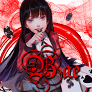
Bae 2,489 / 41,565 Report Post Posted July 27, 2017 Edited July 29, 2017 by Bae The voting period has ended. Johaw @Nematode won by a total of 5 votes. Before you say "Can she count? It's 10" unfortunately, giving your reasons as to why you voted for that person has to count. So, only five people did that. You cannot give you reason anymore. Signature of the Week (SOTW): July 13 - July 27.Brought to you by the Creative Team. Welcome to the second Signature of the Week (SOTW) contest. If you need to read over the rules and guidelines, please refer to this thread: The theme was Freestyle. Here are the listed entries: 1. 2. 3. 4. 5. 6. 7. When you vote, please state your reasons or it won't count. Voting for yourself is not allowed but you may vote each other. Voting period will end on 28-July-17 at 22:00 EST. Edited July 29, 2017 by Bae credits to @Clavers Share this post Link to post Share on other sites More sharing options... Achievements
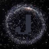
JerryBomb 459 / 9,415 Report Post Posted July 27, 2017 5 In my opinion is insane. I voted for that because the logo looks INCREDIBLE. Futuristic style, the lights, and the splashing water effect looks amazing. Creative Team of GFL. That's it. Share this post Link to post Share on other sites More sharing options... Achievements
HackingPotato 1,297 / 14,301 Report Post Posted July 27, 2017 5 because it actually looks original and the design is sick. Share this post Link to post Share on other sites More sharing options... Achievements
syrus 1,000 / 15,155 Report Post Posted July 27, 2017 I'm voting for #7 or @Nematode's because, it's really hard to make nature look good in paint, but I honestly really enjoyed how it came out. Share this post Link to post Share on other sites More sharing options... Achievements 2
kneegerrlover123 389 / 8,946 Report Post Posted July 27, 2017 Edited July 27, 2017 by Syntax #7 simply because it actually took effort, you can see the beauty of the mountains, and how attractive they are, to me other images seem like image on image with text on the side, to be honest #7 might look like a trollish candidate, but if you think about it, it actually has it's own beauty. All other candidates were amazing and they all put effort into it, it actually took me half an hour to decide, since they're all unique in their own way, after all this is freestyle. Edited July 27, 2017 by Syntax Share this post Link to post Share on other sites More sharing options... Achievements
Bae 2,489 / 41,565 Report Post Posted July 27, 2017 Technically, #7 isn't supposed to be on here because this is a signature contest. Not an art contest but I needed more candidates for more fun and I can see now what kind of people you guys are. credits to @Clavers Share this post Link to post Share on other sites More sharing options... Achievements
Gone 736 / 9,093 Report Post Posted July 27, 2017 Just now, Bae said: Technically, #7 isn't supposed to be on here because this is a signature contest. Not an art contest but I needed more candidates for more fun and I can see now what kind of people you guys are. What makes it a signature and not a signature? Does it have to be smaller? Do i have to put my name over the middle of it? Share this post Link to post Share on other sites More sharing options... Achievements
King_Wailord 968 / 15,913 Report Post Posted July 27, 2017 Has to be #5. stunning design. Nice work! Share this post Link to post Share on other sites More sharing options... Achievements
Ben 2,390 / 32,172 Report Post Posted July 27, 2017 I voted for 5 because it's pretty great. Share this post Link to post Share on other sites More sharing options...
Rena 2,804 / 34,594 Report Post Posted July 27, 2017 I chose 7 because it's actually good for a drawing made in a program like Paint. Share this post Link to post Share on other sites More sharing options... Achievements
Bae 2,489 / 41,565 Report Post Posted July 27, 2017 Edited July 27, 2017 by Bae 1 hour ago, Nematode said: What makes it a signature and not a signature? Does it have to be smaller? Do i have to put my name over the middle of it? It's not just the size, but the style/type of it. Uhhh, how to word this: For some people, it's the focus of the text in an image including the size of the image (smaller). Kind of like how you write out your signature, but you can still have a background or a subject matter. For a few of us, it's the style, medium, and subject matter. Style is just basically the theme or type, medium means resources/materials, and subject matter is the focus of a person, thing, or animal or in most cases is one something is unrecognizable. But I'm not removing you because I needed more variety of candidates. But those who voted for you gotta comment though or it won't count. Only a few commented, so yeah. For your art, it would make more sense toward AOTM (art of the month) or Drawing/Painting contests. Edited July 27, 2017 by Bae credits to @Clavers Share this post Link to post Share on other sites More sharing options... Achievements
rapperdan 2,323 / 0 Report Post Posted July 27, 2017 I voted for 7 I really like the ms paint version of bob ross's art also It's so good I'm gonna add it to my signature. ty for this great signature The best server in GFL better then MilkMans TTT server will ever be Share this post Link to post Share on other sites More sharing options... Achievements 3
Gone 736 / 9,093 Report Post Posted July 27, 2017 36 minutes ago, Bae said: It's not just the size, but the style/type of it. Uhhh, how to word this: For some people, it's the focus of the text in an image including the size of the image (smaller). Kind of like how you write out your signature, but you can still have a background or a subject matter. For a few of us, it's the style, medium, and subject matter. Style is just basically the theme or type, medium means resources/materials, and subject matter is the focus of a person, thing, or animal or in most cases is one something is unrecognizable. But I'm not removing you because I needed more variety of candidates. But those who voted for you gotta comment though or it won't count. Only a few commented, so yeah. For your art, it would make more sense toward AOTM (art of the month) or Drawing/Painting contests. Share this post Link to post Share on other sites More sharing options... Achievements
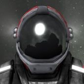
Jcfraven 70 / 2,737 Report Post Posted July 27, 2017 While 5 has a lot of things going for it(creativeness, uniqueness, etc.), I personally prefer 4, due to its relative simplicity while being detailed and expressing the person of the signature(unless Darkling disagrees with that last point, but still, it is neat). Share this post Link to post Share on other sites More sharing options...
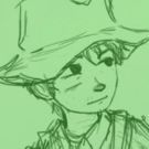
gekkota 684 / 11,375 Report Post Posted July 27, 2017 Edited July 28, 2017 by Gekkota_ I voted for Three. Reason being is that it's more of a signature photo besides the rest. The image is perfect size and I like the creativity to it. It was a close one out of Four ( @Darkling) and Three. I'm not sure who submitted three but I'm pretty sure it was @Rose and not because I have a liking for @Rose it's because it stood out the most. Good luck, guys! Edited July 28, 2017 by Gekkota_ GFL Current and Former Positions: ____________________________________________________ GFL Media Team Graphic Arts Former GMod Deathrun (US) Senior-Admin Former GMod Prop Hunt (US) Admin Former GMod Jailbreak (US) Trial-Admin Former GMod Breach Admin Former GMod Hide and Seek Admin ____________________________________________________ ☆STEAM Profile☆YouTube || GFLClan || GameTracker || Discord: Lynx#9968 ~Made by the lovely @Rose. Thanks. <3 ____________________________________________________ Share this post Link to post Share on other sites More sharing options... Achievements
RekoJehT 2 / 2,126 Report Post Posted July 27, 2017 I had to go with number 7, I mean look at it, it shows that the artist took his time, passion and most importantly it shows a breath-taking scenery. Absolutely stunning work, well done Johaw. Share this post Link to post Share on other sites More sharing options...
Bae 2,489 / 41,565 Report Post Posted July 28, 2017 Voting: I had trouble choosing between 4 & 5. And since I already knew about #5's artwork and I don't want to be bias about it as I've seen it multiple times in our group. I decided to choose #4, and I also like the animation and shine to it. credits to @Clavers Share this post Link to post Share on other sites More sharing options... Achievements
Kubnair 1,158 / 17,225 Report Post Posted July 28, 2017 I voted for 2 ( @Hannah) I love how the words Hannah are worded out in venoms symbiote also love the details like the drool etc. Share this post Link to post Share on other sites More sharing options... Achievements